The Wash / Velvetcream
2019
identity, logotype, cover artwork
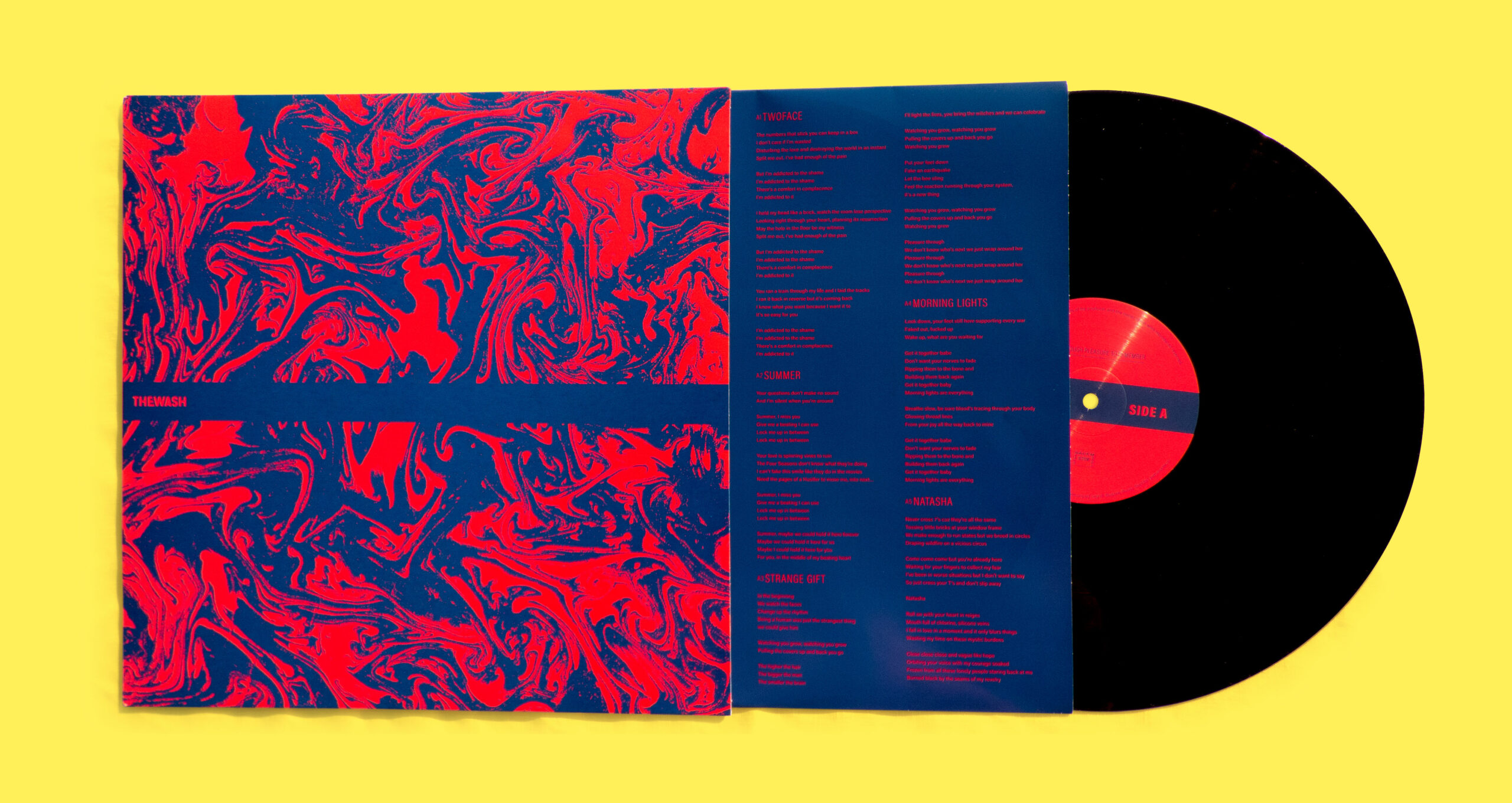
Logotype, social network profiles and album cover for new band The Wash.
The logotype creates a symmetry around the central W through a uniquely shaped E — that mirrors the first stroke of the W — and the capital A — naturally fitting the last stroke of the W. The whole logotype is a custom-made sans serif lettering, and for the textual materials we used Acumin (Adobe fonts) which offers an unusual capital E, reminding of the unique E in the logotype.
The rest of the identity is centered around a blue and red duotone and a distinctive stripe presenting the lettering. For the debut album cover we created a hand-made suminagashi and digitally coloured it, it reflects the rock influences of the band but also gives the artwork a more contemporary feel. For a more vibrant contrast and a smoother surface, the vinyle sleeve was printed in spot colours.


